


AI & Analytics
AI & Analytics
Good and Bad Examples of Data Visualization in 2026
-
Vikash Sharma
- Mar 27, 2026
- 14 mins read

You have spent hours pulling data, running queries, and creating reports. Next, you give your stakeholders a chart, and they look at it vacantly. The wisdom you strived so long to discover? Lost. That is the single biggest pain point in data visualization today: the gap between having the data and communicating it effectively.
Poor data presentation does not just make reports look messy. It causes misinterpreted trends, poor business decisions, and costly errors. Misleading graphs examples are more common than most organizations admit, from truncated axes to overloaded pie charts; bad graphs are everywhere in corporate dashboards, media reports, and academic papers.
Great data visualization follows clear, learnable principles. With proper design, one well-constructed chart can convey the same message that a 10-page report fails to convey.
This guide walks you through real-world examples of good and bad data visualization in 2026, covering what separates a good graph from a bad one and how ProactiveAI helps you consistently land on the right side of that divide.
What Is Data Visualization?
Data visualization is the graphical representation of information and data. By using visual elements like charts, graphs, maps, and dashboards, data visualization tools provide an accessible way to understand trends, outliers, and patterns hidden within complex datasets. Imagine numbers as images in your brain that are easily processed.
In 2026, data visualization has evolved far beyond static bar charts. Modern data visualisation examples include interactive dashboards, real-time streaming visuals, AI-driven chart recommendations, natural language-powered analytics, and even augmented reality overlays for spatial data. The fundamental idea, however, will be the same: encode the data visually in a way that makes sense, is undeniable, and makes action apparent.
Why Data Visualization Matters in 2026
The world is producing vast amounts of data daily, and organizations are no longer asking whether to visualize their data; they are asking how to do it better, faster, and more precisely than others. Data advantage is no longer a possession of the largest data collector but of the best data communicator.
Visual data are represented in the human brain exponentially more quickly than text. Even a simple chart can convey a trend in less than a fraction of a second, while it would take paragraphs of explanation. That speed directly translates to quicker decision-making, a nimbler approach to strategy, and fewer expensive misunderstandings in a business environment.
But there is a critical catch: bad graph examples can be just as dangerous as no visualization at all. A poorly presented chart can guide whole organizations in the wrong direction, and history is replete with cautionary case studies. The discipline of good data visualization is not optional, and it’s a fundamental competency of data-driven organizations.
The Anatomy of a Good Data Visualization
Before examining good and bad data visualization examples, it is worth understanding what separates a high-quality visual from a poor one. All successful graphs have the five essential features that combine to provide knowledge that is accessible and reliable:
| Element | What It Means | Why It Matters |
| Clarity | One clear message per visual | Prevents cognitive overload and confusion |
| Accuracy | Data is represented faithfully and proportionally | Prevents misleading interpretations |
| Efficiency | Minimal chart ink, maximum insight delivered | Respects the viewer’s attention and time |
| Context | Labels, titles, units, and source are present | Eliminates guesswork and ambiguity |
| Aesthetics | Visual hierarchy guides the eye to the insight | Makes the key finding memorable |
An effective visualization is one that passes the five-second test: within five seconds of glancing at it, a new viewer must be able to comprehend the key point. When they are not able, the chart has broken down, no matter how technically correct the underlying information is. Data accuracy and design cannot work independently.
5 Best Data Visualization Examples
Here are five good visualization examples, with detailed explanations of why each one works and which specific design and data decisions make it a model to follow.
1. Clear Bar Chart: Sales Performance Comparison
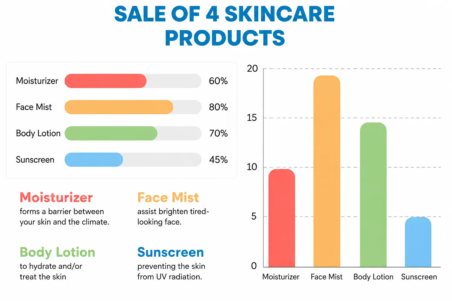
Situation: A retail business makes a comparison of monthly sales in four product lines in Q1 2026.
Why it works: The chart uses a horizontal bar design with labeled axes, all bars in a single color (no rainbow-colored distraction), a straightforward, descriptive title (Q1 2026 Revenue by Product Category), and all values at the end of each bar.
It has no 3D distortion, no decorative clutter, and the zero baseline is not violated. The first thing that the viewer sees is the longest bar answering the key question before reading the label.
What Makes This a Good Graph Example
|
2. Time-Series Line Chart: Revenue Trends Over 24 Months
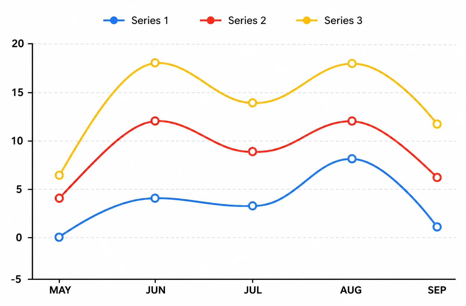
Scenario: Monthly Recurring Revenue (MRR) for a SaaS company is shown from January 2024 to December 2025.
Why it works: Line charts are the appropriate chart type for communicating time-based data, as they inherently show trend continuity and direction.
This is a clean, minimal grid with clearly marked data points separated by regular intervals, an underlined area under the line to highlight the degree of growth, and actual annotations of important business events, such as the product launch date and price adjustments.
The x-axis uses regular monthly intervals, and the date labels are readable, whereas the y-axis shows absolute values on an appropriate, honest scale.
What Makes This a Good Graph Example
|
3. Scatter Plot: Marketing Spend vs. Customer Acquisition
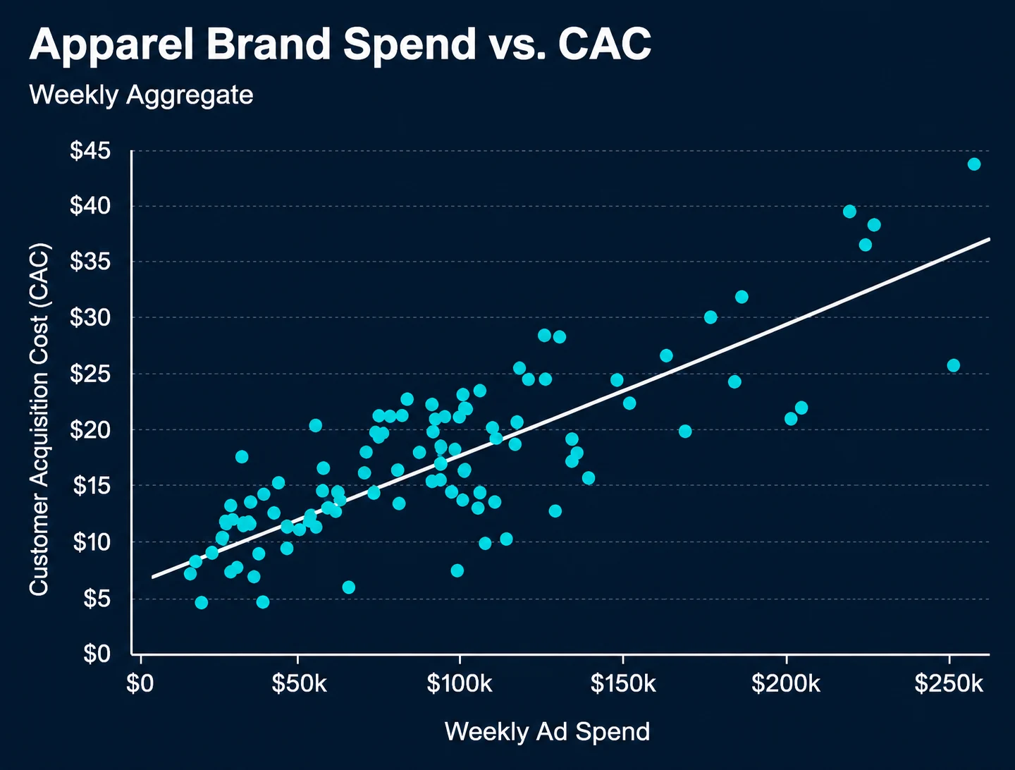
Scenario: A growth team examines the relationship between increased ad spending and new customer sign-ups across 50 campaigns.
Why it works: Scatter plots are more specifically designed to correlate two numerical variables. The example also has a trend line (regression line) to make the statistical relationship obvious, colored data points by campaign type to add a dimension of insight, and clearly labeled axes with units.
The outliers are prominent and marked as such, thereby transforming them into analytical values. More importantly, the title and annotations of the chart do not presume causation, as they are required to assert correlation, which is the truthful and correct explanation.
What Makes This a Good Graph Example
|
4. Heat Map: Customer Engagement by Day and Hour
Scenario: An e-commerce platform shows customer activity by day of the week and hour of the day.
Why it is effective: A heat map is the best way to display intensity in two categories. The example features a linear color scale from light to dark, denoting low and high engagement, in a clearly defined format of days and rows of hours, and a color legend with very specific scale anchors.
The important observation is that peak engagement occurs on Tuesday-Thursday, 7 pm -10 pm, and jumps instantaneously without the need to perform any calculations or readings to determine the individual values of the viewer.
What Makes This a Good Graph Example
|
5. Executive Dashboard: KPI Summary View
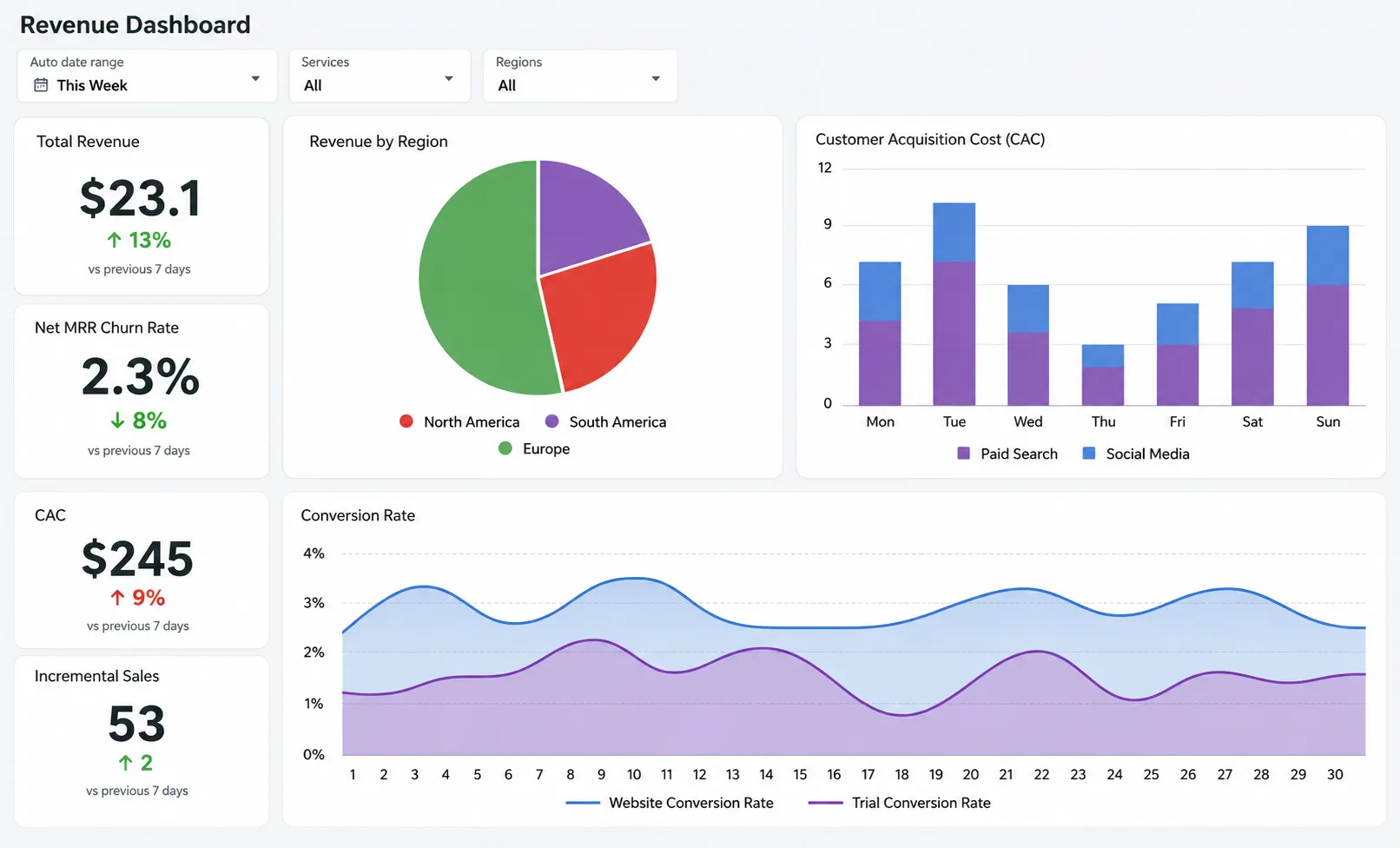
Why it works: The best data visualization examples in executive dashboards share a common trait: ruthless simplicity in service of fast decision-making.
This dashboard includes a large number of cards for key KPIs, small sparkline trend charts for directional context, green and red status for the at-a-glance health evaluation, and drill-down links to people who need more information.
It takes less than five seconds to respond to the question of the morning How are we doing right now? This type of dashboard with self-service analytics can be created using tools like ProactiveAI.
What Makes This a Good Visualization Example
|
5 Bad Data Visualization Examples And Why They Fail
Now, let us examine five bad graph examples, the types of visualizations that mislead, confuse, or simply fail to communicate the data they claim to represent. It is equally crucial to understand these patterns as it is to learn about the positive ones, since recognizing them will help you guard your organization against making decisions based on bad visual data.
1. Misleading Truncated Axis Bar Chart
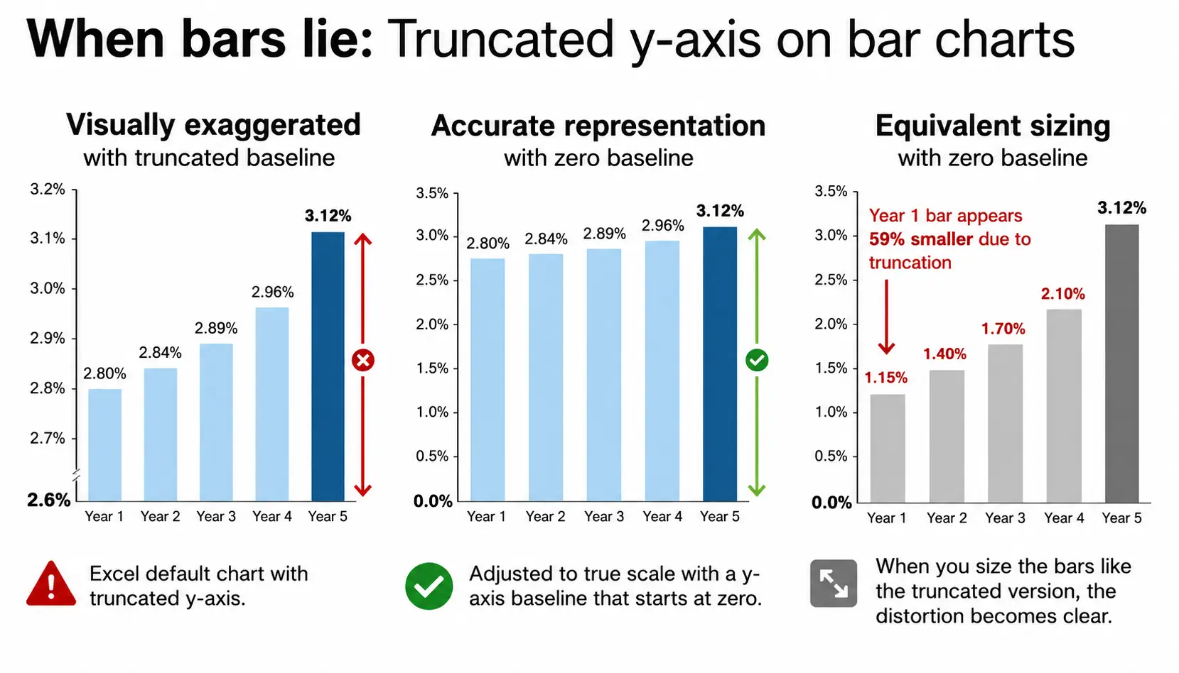
Why it breaks down: By positioning the y-axis at 44 per cent rather than zero, the 2-percentage-point difference between Candidate A and B will appear enormous on the screen, leading one to think Candidate A has a 3-to-1 advantage.
This is one of the most common and consequential examples of misleading graphs in media and political communication. It exploits the human brain to estimate relative bar heights without checking the axis scale, a cognitive shortcut that bad actors specifically target.
What Makes This a Bad Graph Example
|
2. Overloaded Pie Chart with 12 Slices
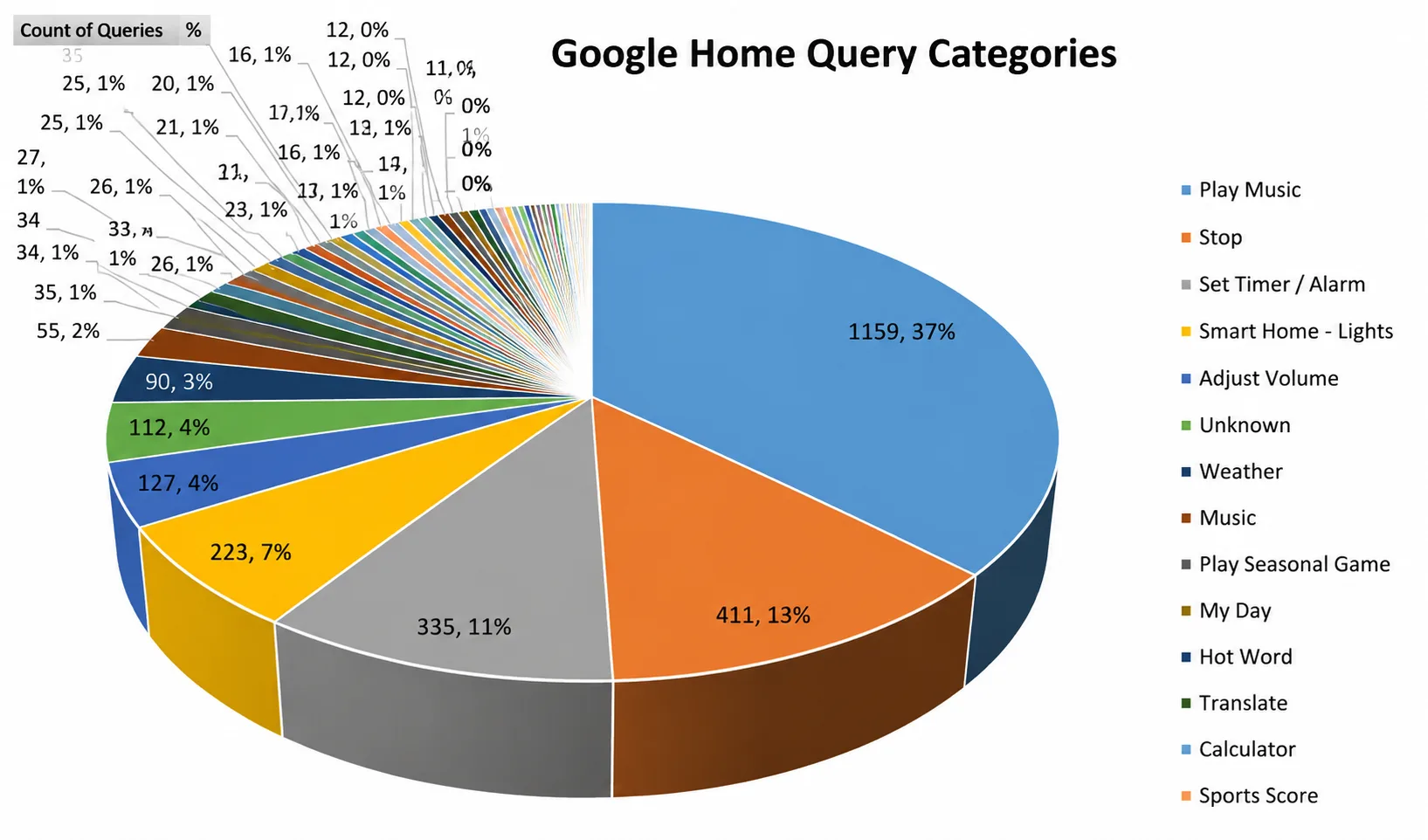
Why it breaks down: The human visual system cannot effectively perceive the difference between similar-sized angles in a pie chart. Using 12 slices of similar size, some of which are almost identical despite being 2 to 3 percentage points apart, which is significant for making budget allocation choices.
The chart makes a color display that is analytically useless. Pie charts should contain only 3 to 4 categories, with clear differences in proportions. All the rest is a part of a ranked bar chart.
What Makes This a Bad Graph Example
|
3. 3D Bar Chart That Distorts Proportions
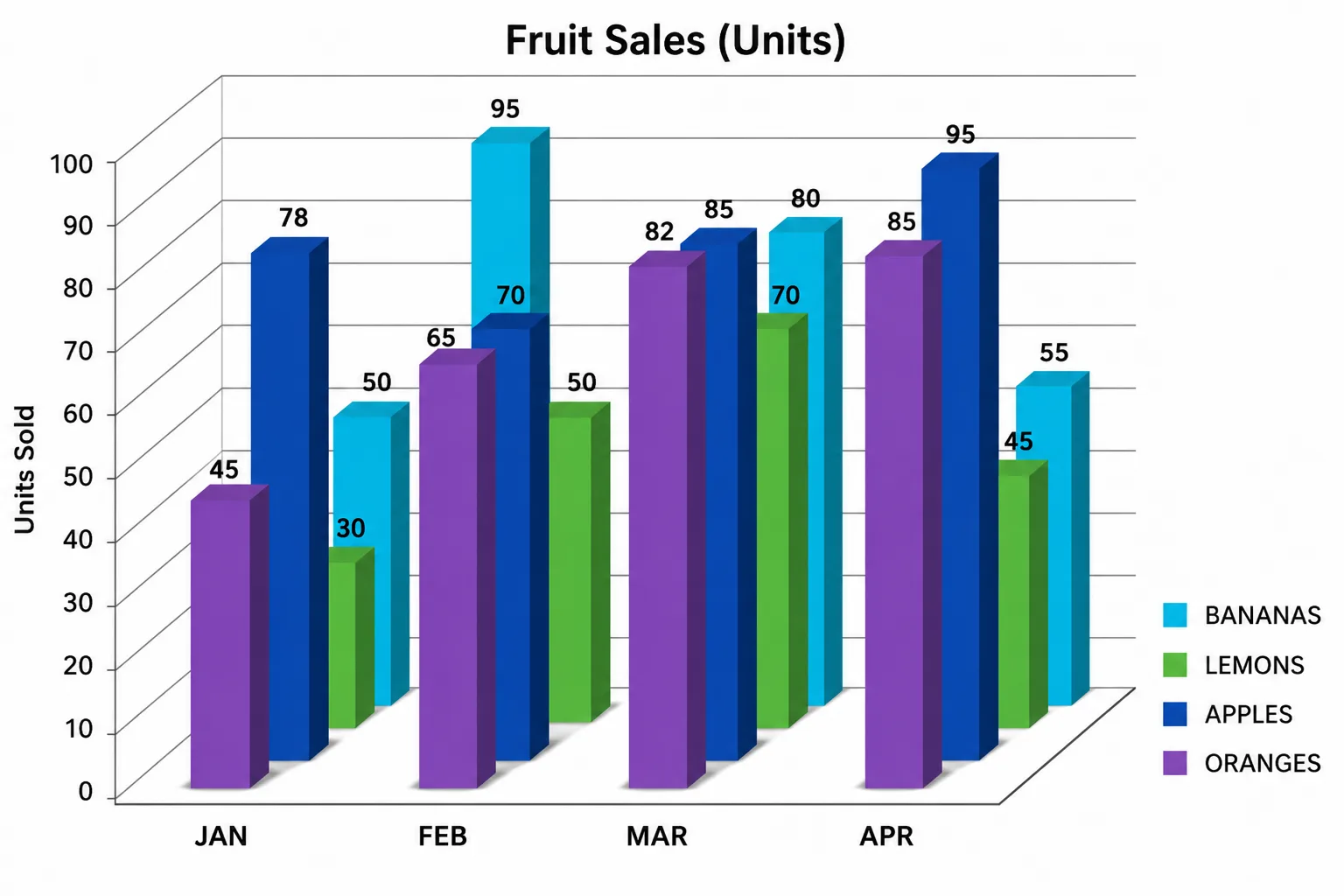
Scenario: A quarterly business review uses 3D bar charts with perspective depth and dramatic shadows to compare sales performance across five regional offices.
Why it breaks down: Three-dimensional charts introduce a lot of visual complexity but do not introduce any dimension of data.
The perspective effect causes the apparent bar heights in the back of the 3D perspective to be shorter than they actually are, even when they depict values that are identical to or greater than the front bars.
Shades and refracting surfaces introduce additional visual noise, completely obscuring the data. The value in 3D charts cannot be correctly read by the viewers. They appear aesthetically beautiful, yet they are always deceptive.
What Makes This a Bad Graph Example
|
4. Dual-Axis Chart Implying False Correlation
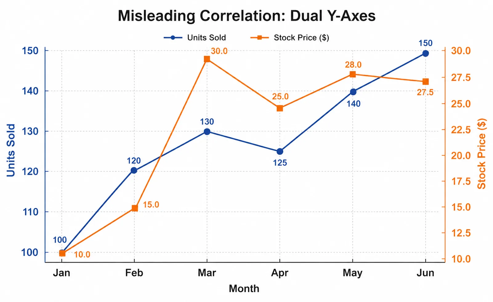
Why it breaks down: Dual-axis charts are the most misused visualization charts in business communication.
They produce a strong visual impression of a relationship between two variables, even in the absence of a causal relationship or when the two variables operate on entirely incompatible scales.
In independent scaling of every axis, the designers can make any two seasonally correlated or unrelated trends seem synchronized. It is arguably the most advanced type of statistical manipulation in visual form and can be found in corporate presentations, the mass media, and shareholder communication.
What Makes This a Bad Graph Example
|
5. Cherry-Picked Time Range Line Chart
Scenario: In a certain company, the stock price increased by 40% during the past 6 months. A presentation to investors would include a line chart that will be only within that 6-month period, excluding the previous 18 months during which the stock price has reduced by 60% of its high.
Why it breaks down: The choice of the time window presented is one of the more subtle but more significant types of visualization data manipulation.
The chart is technically correct; no data is created or modified. However, by excluding the historical perspective, it produces a very misleading story about the companies’ performance.
It is rife in financial marketing, political communication, and media reporting, and it is extremely hard to spot unless you are already aware that he intended to exclude a particular period and that that window was deliberately selected.
What Makes This a Bad Graph Example
|
Side-by-Side Comparison of Good vs Bad Data Visualization
Here is a comprehensive side-by-side comparison of what separates good data visualization from bad visualization across the dimensions that matter most in practice:
| Good Data Visualization | Bad Data Visualization |
| The title is clear and descriptive, explaining what the chart is and why it is important. | The title viewer will have to guess what data it is and what the purpose of the chart is because of vague or absent title views. |
| Bar and column charts Y-axis begins at zero, proportions of the charts are honest. | Artificially inflated axis that dares to deceive with small numeric variations. |
| No more than 2 or 4 colors used with intentional and consistent meaning. | No systematic meaning or data. Rainbow, 10 or more colors, decoration only. |
| Contextual annotations and labels of data that are to be confidently interpreted. | None of the labels would have to calculate the values based on the gridlines or the positions of the axis. |
| Annotation, emphasis, or visual hierarchy can be used to point out key findings. | No information, including all the data sets that are considered equally significant, is brought to light or given priority. |
| A complete range of time represented with arbitrary start dates is revealed. | Cherry-picking of a time window that is chosen to suit a certain pre-determined story. |
| The statistical outliers that were recognized and identified became wisdom. | Outliers, which were simply deleted from the visual without disclosure or explanation. |
Common Chart Types & When to Use or Avoid Them
Choosing the right chart type is one of the highest-impact decisions in the entire data visualization process. Here is a practical reference guide for the most common chart types:
| Chart Type | Best Used For | Avoid When |
| Bar Chart | Comparing categories, showing rankings by value | Continuous time series with many data points |
| Line Chart | Time-series trends, showing continuous change | Comparing unordered categories without sequence |
| Pie Chart | Part-to-whole with only 2 to 3 distinct categories | More than 4 categories; categories with similar values |
| Scatter Plot | Correlation between 2 numerical variables | Showing trends over time; categorical comparisons |
| Heat Map | Density across 2 categorical dimensions simultaneously | Small datasets; when exact values are critical |
| Histogram | Distribution of a single continuous variable | Comparing distributions across multiple groups |
| Box Plot | Showing spread, median, and outliers in the data | Audiences unfamiliar with statistical visualization |
| Treemap | Hierarchical part-to-whole with nested categories | When a precise numerical comparison is required |
| Bubble Chart | Encoding 3 quantitative variables simultaneously | When viewers need precise readings of all variables |
| Waterfall Chart | Sequential positive and negative contributions to a total | Non-sequential or randomly ordered data series |
Best Practices for Data Visualization in 2026
The following best practices represent the collective consensus of leading data visualization researchers and practitioners. They are essential to the making of credible, trustworthy, and truly useful visualizations:
1. Design Principles
- Begin with an effective question that the chart must address.
- Select the type of chart to use and then settle on a design.
- Begin bar/column charts at zero so that you do not produce misleading graphs.
- Only use 2-4 colors, but only to depict meaningful categories.
- Label information directly, rather than relying much on legends.
2. Data Integrity
- Present the entire range of data unless an explicit reason is given to the contrary.
- Always provide sample size and confidence intervals of statistical information.
- Equate correlation with causation.
- Point outliers rather than silently delete them.
- When comparing multiple charts, use consistent scales.
3. Communication
- Write specific, descriptive headings.
- Add notes on historic observations or events.
- Develop visuals for the design based on the target audience.
- Ensure the main point is clear in 5 seconds.
- Eliminate unnecessary graphics to maintain the clarity of charts.
How ProactiveAI Elevates Your Data Visualization
At ProactiveAI, we believe powerful data visualization should be accurate, intuitive, and accessible to everyone in an organization. We have built our platform to avoid the usual visualization errors and to enable teams to transform raw data into coherent, actionable information.
We have an AI-enhanced chart recommendation that automatically selects the best visualization based on your data structure and analysis objective. To guarantee reliability, our platform also runs automated data quality tests that identify missing values, outliers, and inconsistencies and prevent the generation of charts.
ProactiveAI also provides natural-language query support, allowing you to pose questions in plain English and visualize the results immediately. Lastly, teams can harmonize, add context, exchange interpretations, and make faster, data-driven decisions together using collaboration and annotation tools.
Conclusion
Data visualization sits at the intersection of data science, communication design, and business strategy. Properly implemented with the right chart type, truthful and equal-proportion data illustration, full context framing, and a comprehensive narrative direction, among others, is one of the strongest competitive weapons an organization can use today.
The good and bad data visualization examples in this guide illustrate a consistent and learnable truth: the difference between a chart that enlightens and one that misleads often comes down to a handful of deliberate design choices.
In 2026, organizations will not be able to communicate data haphazardly. Competitive advantage lies with those who can not only gather and analyze information in a time-saving manner but also present it in a graphic representation that is accurate, truthful, and easily comprehensible to prompt and decisive action.
Tools such as ProactiveAI are specifically designed to bridge that divide and automatically apply best practices in visualization across all the charts, dashboards, and reports generated by your organization.
Frequently Asked Questions
How can businesses evaluate whether a data visualization is effective?
The first is the five-second rule: the main message can be grasped by the audience in a few seconds. If stakeholders require lengthy descriptions or misconceive the chart, the visualization may lack clarity, context, and an appropriate design structure.
What role does color play in effective data visualization?
Color is useful to emphasize patterns, categories, or anomalies, but too many colors will confuse a user. The most successful charts use two to four significant colors to guide attention without complicating readability or causing visual distractions.
How can interactive dashboards improve data interpretation?
Interactive dashboards enable users to filter, drill down, and explore data interactively. This assists stakeholders in turning high-level insights into detailed information quickly, enhancing the decision-making process without overwhelming viewers with too much information.
Why is audience awareness important when designing charts?
Charts are interpreted differently by different audiences. Quick KPI summaries may be preferred by executives, whereas analysts may demand greater statistical detail. Tailoring the visualization complexity to the audience ensures that insights are clear and communicated efficiently.
What is the biggest mistake organizations make with dashboards?
Another common pitfall is displaying too many charts and metrics on dashboards. This creates cognitive load and obscures the most crucial insights, making it more difficult to identify essential trends in decision-makers’ decisions within a short time frame.
You might also like
Handpicked articles for your reading list.


Get the latest insights on Conversational AI
Stay ahead of the curve with weekly updates on data analytics, AI trends, and eCommerce growth strategies delivered straight to your inbox.
Join 5,000+ industry leaders. Zero spam, just pure insights.